Friends,
Number Four: Charles Wright - Chickamauga. I don't know why I like it, it's simple, I like lips, and Chickamauga is a great word to say. Just say it out loud, slow, let yourself love those syllables in that word.

Number 3: Mike Magnuson - Right Man for the Job. The contrast between the orange background and the gas can is great. And that dirty orange color does draw your eye to it, but doesn't repulse, like if it were bright orange. The burnt orange has a blue collar connotation (at least to me...I used to live next to a house that was painted this color). Plus, the gas can plays a bit of a role in this book too, I don't want to ruin it for you, but it's nothing that Buddhist monks protesting Vietnam hadn't thought of before.
Second: Flannery O'Connor: Wise Blood/The Violent Bear It Away. Really, it's the entire series of O'Connor books that came out with that style of cover that pleases me. Actually, all the O'Connor books I own are from this period of O'Connor covers. I like the colors, the matte look to them, the drawings, the font. All of it I find very pleasing to the eyes.


Number One: Marilynne Robinson- Housekeeping: For one, this is a magnificent book. She won the Pulitzer for her other book Gilead, but that would almost have to be a make up Pulitzer for not giving it to her for this book (kind of like how Richard Russo got his for Empire Falls)For two, this is a haunting cover, and just beautiful too. Look at all that white space, and the train tracks seemingly leading on into nothingness, but still leading there just the same. Trains have a huge role in the book too, from people riding the rails hobo style to the train wreck that kills the narrator's grandfather (and it is a spectacular crash too, the train leaves the tracks going over a frozen lake...I'm not going to say anymore). Seriously though, you should read this book, but only if you like your books good. I mean, maybe you like bad books the way some people like Quiet Riot.

___________________________________
Other blogging friends (like Jorge & Ande) have been compiling lists and asking others to talk about them, so I figured I should give it a swing too.
8 Things That Annoy Me:
8. Problems I can't solve. I mean this in all aspects.
7. My weight, hairline, eyebrows, etc. You know, the things that make me feel unattractive.
6. Time.
5. The baseball offseason.
4. Professional athletes who: demand trades/over thank God/only play for money/who excessively celebrate (like when a football player tackles a guy for a loss then has to do a dance, even though his team is losing by 3 touchdowns).
3. The scrolls on televisions channels, and the stupid icon in the corners of the channels.
2. Persistent small noises. Like ticks of a clock, or drips of a faucet, or radio lightly playing from some place in the distance. Maybe this one is universal, but I don't care. I don't like them.
1. Anything that is half-assed.
I'll do the "strange things about me that you may not know" post when I get a good list of that put together.
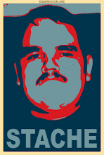
VIVA EL MUSTACHE


1 comment:
I'm with you on the Flannery O'Connor covers--I especially like the font--and Magnason has a great cover, too, with that flaming orange and centered gas can. It's really striking.
I thought the one with the lips was sort of creepy...but maybe it's supposed to be.
Post a Comment